Brand Guidelines by Spotify

Our logo
We are very proud of our logo, and we require that you follow these guidelines to ensure it always looks its best. Our logo is the combination of a simple and modern wordmark with the icon.
Icon
In cases when the Spotify brand has already been established we simply use the icon on its own. While the icon can exist without the wordmark, the wordmark should never exist without the icon.
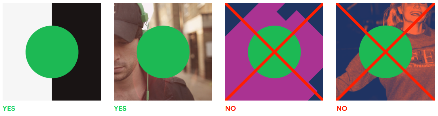
The Spotify Green logo, pictured top left, is our primary logo colorway, and it should only be used with Black, White, and non-duotoned photography.
Please note: The Spotify green logo should only be used on a black or white background, for any other background you should use a monochrome logo.
The black logo should be used on light colored backgrounds.
The white logo should be used on dark colored backgrounds.
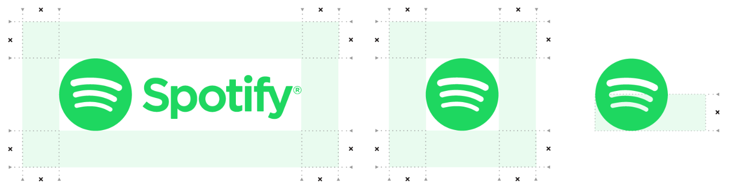
Exclusion zone
The logo and the icon’s exclusion zone is equal to half the height of the icon (marked as × in the diagram).
Minimum size
Establishing a minimum size ensures that the impact and legibility of the logo is not compromised in application.
The Spotify logo should never be smaller than 70px in digital or 20mm in print.
The Spotify icon should never be smaller than 21px in digital or 6mm in print.
Logo misuse
It is important that the appearance of the logo remains consistent. The logo should not be misinterpreted, modified, or added to. No attempt should be made to alter the logo in any way. Its orientation, color and composition should remain as indicated in this document — there are no exceptions.
Our colors
Spotify has always been green, and that won’t change. While embracing a much more colorful language in our brand communications, Spotify Green is our resting color, used only in situations where the brand palette is not being used.

#1DB954
R30 G215 B96
C80 M0 Y80 K0

#FFFFFF
R255 G255 B255
C0 M0 Y0 K0

#191414
R25 G20 B20
C0 M0 Y0 K100
*This green is darker than the green we use on the Spotify logo, which we refer to as light green. The green featured above is optimized for accessibility and legibility. Light green is only intended to be used with the official Spotify logo.
Rules with colors
Spotify Green should only ever sit on white, black, or a non-duotoned photograph. Spotify Green will mostly exist in the app. Spotify Green should never be used as or with a color from the brand palette, or a duotoned image.
Use of our content
The content which is available through the Spotify platform is owned by many different rights holders. If you use that content you must comply with the rules set out in our Developer Terms of Service. If you use any Spotify metadata (including artist, album and track names, album artwork and audio preview clips) it must always be accompanied by the Spotify brand and links back to the Spotify Service as described in the Developer Terms. If you incorporate any streaming functionality, this must also include clear Spotify branding and comply with the additional limitations set out in the Developer Terms.
Our widgets
We provide several widgets: Spotify Play Buttons and a Follow Button.
No pairing brands
You should not use the Spotify brand together with any other brand or in any co-branded communications. Pairing of brands is not permitted under our Developer Terms.
Thank you!
If you are having trouble with anything in this guide, you are missing brand elements from the brand package, or you are unsure if your communication best represents the Spotify brand, please contact the Spotify design team at brandapproval@spotify.com.
Live Preview
About this template
VIEW ALLBrand guidelines are, in essence, your company’s manual on how to “use” your brand. It codifies how you, as an organization, present yourself to the world and communicate your personality.
Brand guidelines will be referenced by everyone who touches your brand, internally or externally, which is why consistency and clarity are critical. Consistent guidelines ensure that your brand is always communicated in a uniform way, even when you have different teams working on product design, customer service, marketing, and sales. They help designers, developers, and marketers all stay on the same page, presenting a unified image of your brand and your company to the public.
Spotify offers a great example of how to document and structure your brand guidelines. Their guidelines cover everything, from their logo and colors, to naming and communication, yet it's still short and simple.
Originally published here: Branding Guidelines | Spotify for Developers.